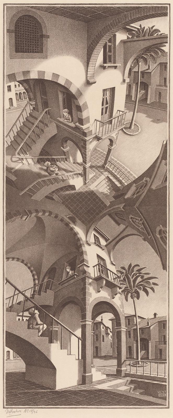
Up and Down
Throughout his career, Escher often experimented with perspective because it allowed him to trick viewers. He usually did so with straight perspective lines, until he realised that a curved perspective line more closely matched what our eyes perceive. Our eyes are always moving, and a curved perspective is the best way to visualise reality on paper. Escher used this insight in a way that no one else does. In Up and Down, he combined the vanishing point directly below you (the nadir) with the point directly above you (the zenith) in a single image. And he did this so ingeniously that it only becomes apparent at second glance that the end result is impossible. The best way to illustrate this is to cover the top or bottom half of the print with a piece of paper. You will then see a tower with windows, a balcony and a staircase. On the stairs sits a boy looking up at a girl in the window above him. Despite the extreme perspective, your eyes can easily follow this image, although your gaze is strongly drawn upwards or downwards. Depending on which half you choose to cover, all perspective lines disappear into a tiled floor or ceiling. Now remove the paper and suddenly you realise that the tiles appear three times: below as a floor, above as a ceiling and in the centre as both a ceiling and a floor. In between, Escher depicted the scene twice. Because he did so from two different perspectives, the top and bottom are completely different from each other. Yet he managed to create a logical image. Although your eyes never really find rest in this masterful print.