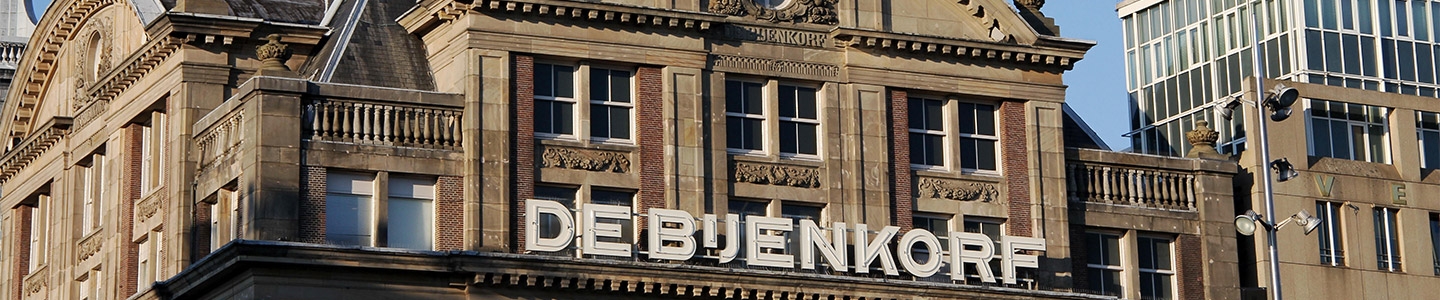
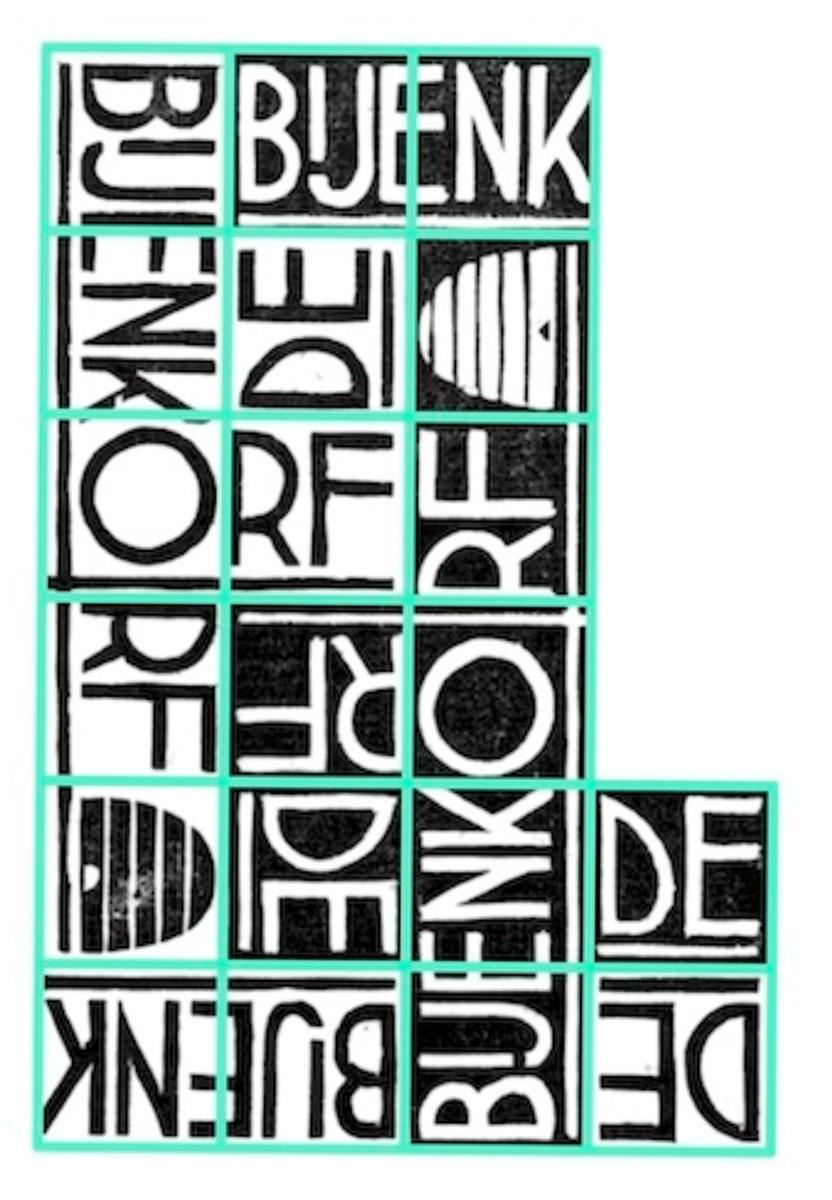
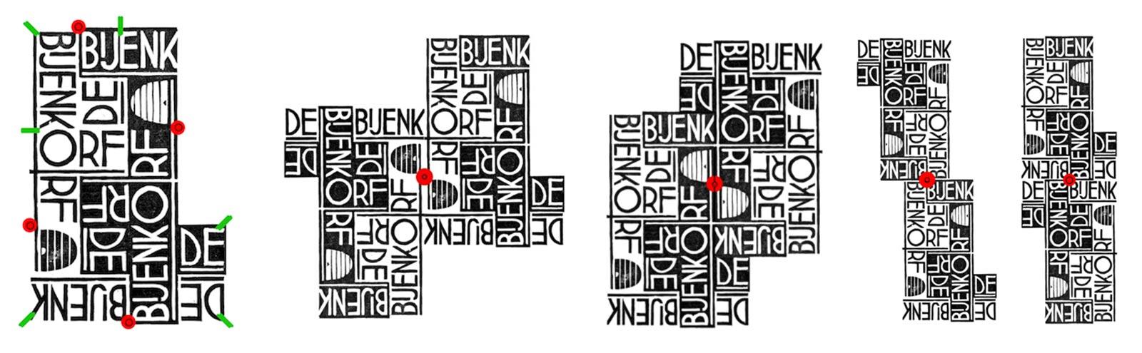
The first design would be for the Dutch department store De Bijenkorf (The Beehive). A bit like the Macy's department store in the US, De Bijenkorf has a long history and is very much a presence today. Founded in 1870, De Bijenkorf advertises itself as “the most renowned chain of premium department stores in the Netherlands. With flagship stores in Amsterdam, The Hague, Rotterdam and Utrecht and smaller stores in Amstelveen, Eindhoven and Maastricht...” [2]. Through the years, the store has had many logos, each reflecting the style of design in its time. In the first half of the 20th century, the logos featured a classic domed beehive [3] and Escher was aware of this. (Today their design emphasis is more on honeycombs than on beehives.)
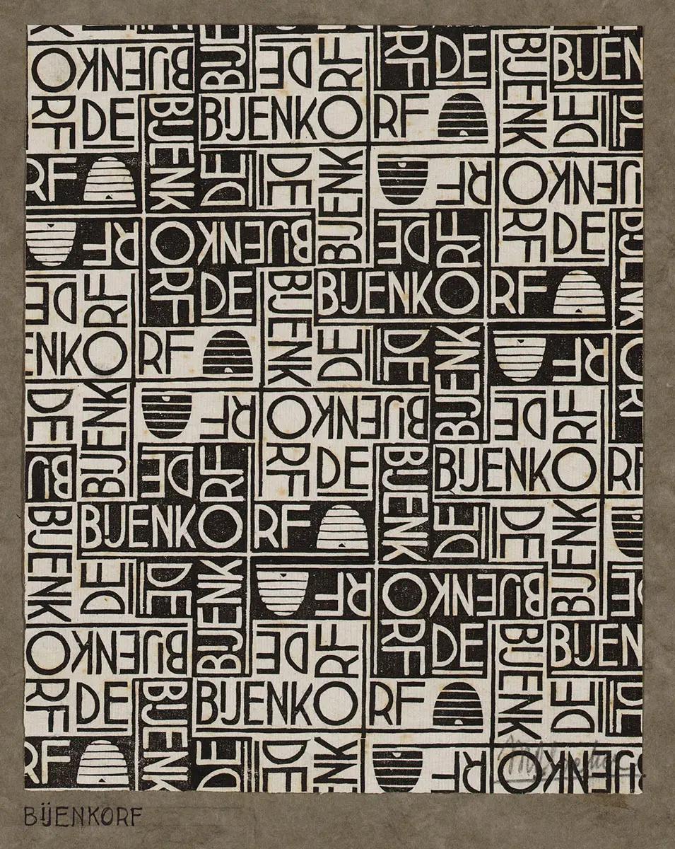
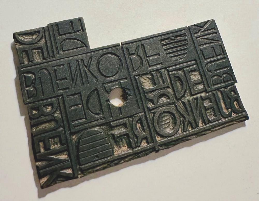
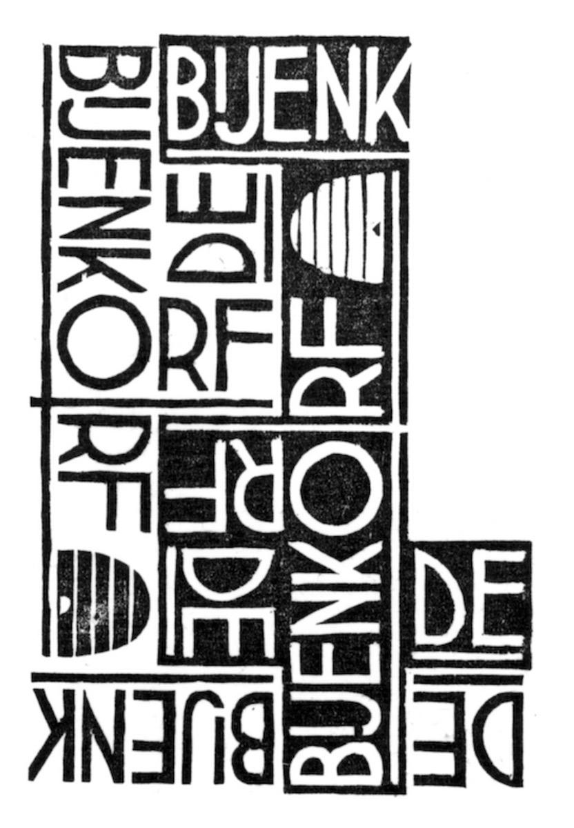
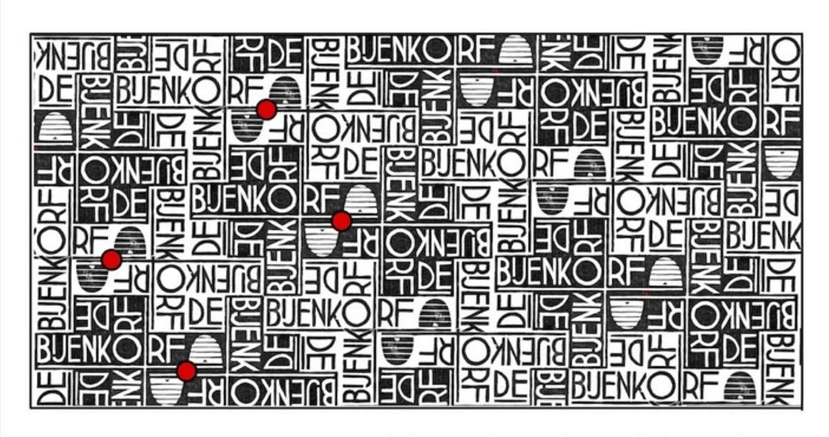
Gift-wrapping paper is used to decoratively cover packages of many different sizes and shapes, and so Escher's challenge was to design an interesting pattern from which the store's name would be immediately recognizable. His design would contain a beehive and the words “De Bijenkorf” that could be easily read from any of four directions: up, down, left, or right. On September 26, 1933, Escher signed a contract with the Van Der Spruyt Paper products factory in Enkhuizen, transferring the copyright of his design for gift-wrapping paper to be manufactured for De Bijenkorf. Attached to the contract was an imprint of his woodblock (Figure 2, left) that gave no hint of the allover design that it would produce [4]. A few weeks later, Escher wrote to his good friend Bas Kist, “To my delight, I managed to sell the Bijenkorf design (for 60 guilders). This gives me confidence.” [5].