

Reflection is a recurring theme in the work of Maurits Escher. This in itself is not that surprising. Most artists produce a self-portrait at some point. Escher carved his first self-portrait while he was still living in Arnhem and he continued to create successive self-portraits at regular intervals during his career. Escher used ordinary mirrors, but Escher also used other reflective surfaces. Below you can find some examples.
An ambitious ink drawing - completed while he was still a student - is dominated by the brass sphere of one of the large chandeliers in the Grote Kerk (Large Church) in Haarlem. Surrounded by a mass of sinuous lines, the sphere is a point of repose in the drawing. Reflected on the surface of the sphere we see the nave of the church. Viewers who look closely will see Escher depicted as a little figure lying on the floor.
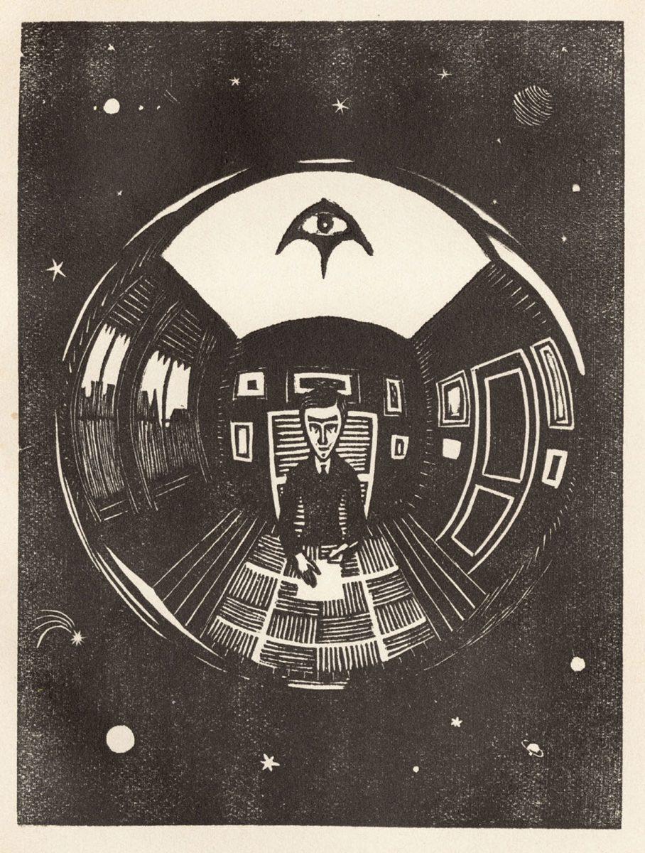
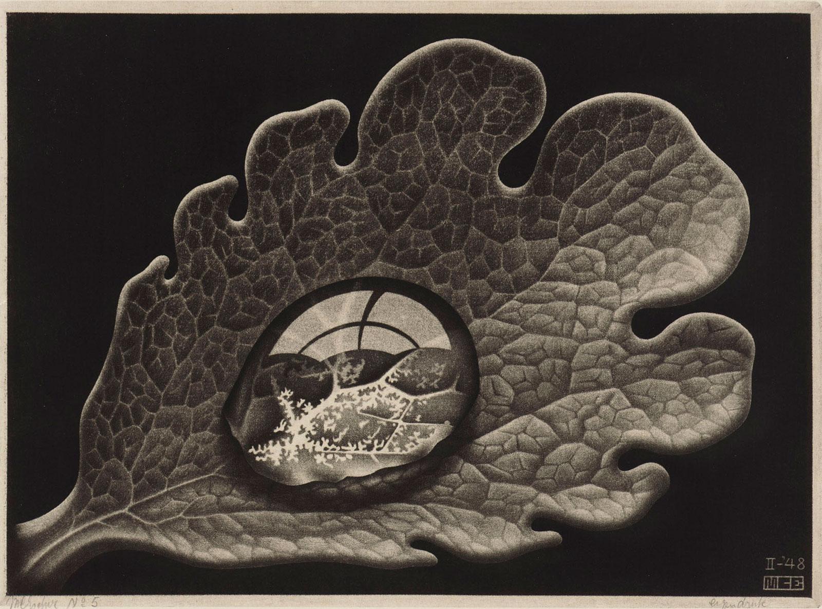
The woodcuts Escher created for the little booklet Flor de Pascua, published by his friend Aad van Stolk in 1921, included another miniscule self-portrait in a reflective sphere. This was the first in a series that culminated in Hand with reflecting sphere (Self-Portrait in spherical mirror) in 1935, which is of course one of Escher’s most famous works. The mezzotint Dewdrop, which Escher completed in 1948, depicts an exquisitely detailed reflection in a tiny little spherical surface in the natural world.
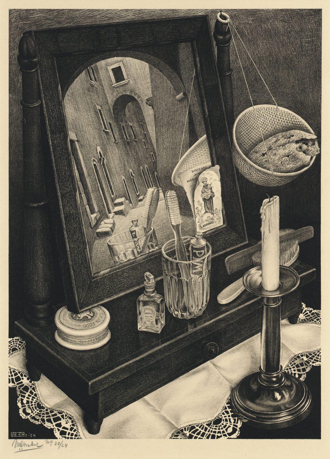
Escher also used a mirror to introduce a misleading element in the lithograph Still life with mirror. As far as I am concerned, this is a classic work for here we see Escher incorporates a clever optical illusion for the first time. The image reflected in the mirror is actually physically impossible. The mirror, which is tilted at a slight angle, is clearly in a room. We can tell this from the everyday objects placed around the mirror: a glass with a toothbrush and a tube of toothpaste, a brush and comb, a brass candlestick, the little basket hung at the side of the mirror and so on. Some of these items are reflected in the mirror. All of this initially strikes the viewer as completely normal, but nothing could be further from the truth. For also reflected in the mirror we see a little Italian street, an alley.
Because the toothbrush in the glass is reflected in the foreground of the scene depicted in the mirror, it is not immediately obvious that the street scene, which is supposedly outside the room, cannot coincide with the interior that surrounds the mirror! It eventually dawns on viewers who spend a little bit longer and look a little bit closer that the street cannot possibly be opposite the mirror. The fact that the mirror is tilted at a slight angle means that the street would have to be up at an angle behind us. Finally we see the mirror through the eyes of the artist! The two worlds so cleverly combined in the image cannot coexist, but it usually takes viewers a little while to unravel the illusion.
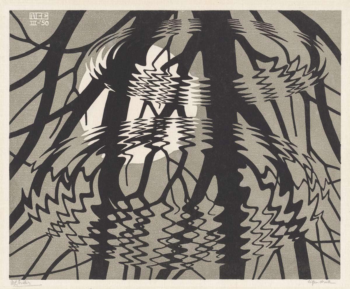
The reflections featured in Escher’s works can be divided into two main categories: objects mirrored in flat or spherical reflective surfaces and scenes reflected by surfaces in nature. Rippled surface falls within the second category. At a symposium in 1986 Escher’s oldest son George told the story of how his father came up with the idea for this print. He described how his father always went for a daily walk in the forest near his house in Baarn:
"One bright winter day he found himself standing at the edge of a pitch-black pond surrounded by the majestic trees in the forest. As he looked at the quiet pond he became fascinated by the perfect reflection of the moon and the silhouettes of the trees on the still surface of the water. As usual, he bent his head to the side slightly in order to see the reflection from below. Then he turned his back to the pond and bent forward so he could gaze at the water from between his knees. Using his hands to conceal the bottom part of his view so he could no longer see the foreground, it was easy to imagine that he was standing upright and staring at the sky. Here I am with my head down, he mused, grinning to himself. Yet my senses tell me I’m looking upwards! While he stood there a squirrel in one of the trees overhead dropped an acorn into the pond, which shattered the surface of the water. As the pond slowly settled again, his father stood there riveted by what he saw. “How amazing!” he thought. “A few little ripples tell me that I’m looking at a body of water and not at a tree!” This incident in the forest resulted in Rippled surface. However, in order to see the scene as Escher first saw it, the print needs to be rotated 180 degrees."*
Escher’s own account of Rippled surface is simpler and attributes significance to the manner in which the scene is depicted. Describing the work in the book Grafiek en Tekeningen he says:
"Two raindrops fall into a pond and, with the concentric expanding ripples that they cause, disturb the still reflection of a tree with the moon behind it. The rings shown in perspective afford the only means whereby the receding surface of the water is indicated."**
Rippled surface is a typical Escher piece. It is necessary to study the image for a little while to work out precisely what is going on. The complex composition initially obscures the subject of the print, which is the moon shining through the bare branches of a tree. Once you spot the moon, for a moment you are mystified as to why there is a shimmer in the air, until the penny drops. You make the association with liquid and realise that you are looking at a body of water. There is no point of reference for the eye: there is no bank or water bird to provide context. This is almost an arbitrary section of a reflection in nature. Because the scene extends beyond the edges of the print, it is possible to imagine that you are looking at a large lake.
It is also worth noting that Escher chose to create this image as a linocut, a print-making technique he rarely used as an adult. It was easier to carve the fluid parallel lines in linoleum because it is much softer than wood. This might be the reason why he chose to use this technique.
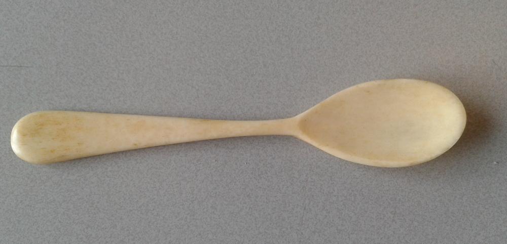
The sky of the print is a lovely grey-green colour. The colour of the ink and the pressure Escher applied with his bone egg spoon as he produced one print after another would undoubtedly have meant that each print had subtle and unique variations in colour. Prints are identical, but there are always slight differences in colour in Escher’s prints, because of the care with which he applied pressure with the little spoon. We occasionally forget just how carefully Escher handled his blocks and the same would have applied to the sheet of linoleum. He described the process in an interview in 1967:
“If you handle a piece of wood carefully, it is possible to produce hundreds of prints from it, as I do. The earlier prints are in no way superior to the later ones. In fact, the opposite may be the case: if you learn and make small adjustments as you go along, the later prints can be better than the earlier ones.”***
It was not was not possible or necessary to apply much pressure with the little spoon. Escher deliberately used very thin paper that absorbed ink easily. He purchased this Japanese paper and also exchanged prints for paper with the large Johan Enschedé printing firm in Haarlem, which he worked with on several occasions. With the exception of his lithographs, Escher did all of his own printing, so he was always able to control the quality of the work. He was also present when his lithographs were printed, so he was able to monitor the prints right up to the last moment.
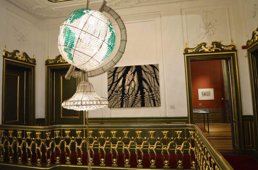
At Escher in The Palace we have we a large tapestry of Rippled surface, which was made for the municipality of Oldenzaal in 1967 and presented to us on long-term loan. Escher consented to the production of the tapestry, which was hand woven by the Edmond de Cneudt hand-loom and carpet weaving firm in Hilversum, which had woven other tapestries designed by Escher.
Sources of quotations:
*M.C.Escher: Art and Science, edited by H.S.M. Coxeter, M. Emmer, R. Penrose and M.I. Teuber, Elsevier Science Publishers B.V. 1986 p. 4.
**M.C. Escher Grafiek en Tekeningen, with an introduction and commentary by the artist, Taschen GMBH 2006 re-edition of the book originally published by Koninklijke uitgeverij J.J. Tijl NV, Zwolle 1959, p. 13.
***M.C. Escher Op-art graficus?, AO-Reeks booklet 1172, 1967.
More stories about Escher


Escher's space

